Smirnoff Ice - Same Swig, New Swag
Revive the OG of RTD with Visual Refresh and Energetic Motion
YEAR 2023
CLIENT Diageo
AGENCY Design Bridge and Partners
MY ROLE Modeling, LookDev, Liquid Simulation, Animation, Rendering
DURATION 3 Weeks Prep + 72hr crunch
TOOLS Cinema 4D, X-Particles, After Effects, Illustrator, Photoshop
AWARDS Transform Awards Gold
CREATIVE DIRECTION Christian Bird
DESIGN DIRECTION Vivi Florez
STORYBOARD Greg Gayle
2D MOTION Jeremy Freedberg
3D & ANIMATION Gan Lin
PHOTOGRAPHY Ted and Chelsea
STRATEGY Katie Hughes
CLIENT TEAM Bridget Ashley, Shang Wu, Lisa Lee, Hania Midura
INTRO
A Classic Reimagined Launched in 1999, Smirnoff Ice was the pioneer of the RTD (Ready-to-Drink) category. However, after 23 years, the brand’s visual identity——defined by metallic grays and a “surgical” industrial coldness—began to feel like a relic of the early 2000s. To reclaim its throne in a market now saturated with hard seltzers, Diageo partnered with its long-time agency partner Design Bridge New York for a massive brand reinvention.
The goal was a total “glow up”: moving away from the icy, edgy aesthetic of the past and toward a vibrant, flavor-first world that resonates with Gen Z while staking a new claim in today’s culture.
This was the largest-scale project of my career at the time. I was thrilled to contribute my 3D motion expertise to a launch reel that successfully positioned a legendary Y2K legacy in its next era.
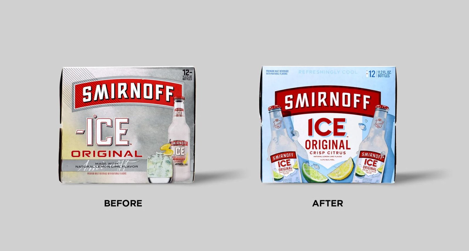
From icy-industrial-metallic asthetic to a sunny, fruit-forwarded look
CHALLENGE
A Year of Design, A Week of Motion By the time I joined the project, Design Bridge’s strategists and designers had already spent over a year refining the brand architecture on what was known internally as the “dream brief.” They had iterated through hundreds of label designs, ditching the “minus one degree” gimmick and metallic foil for a system anchored by vibrant fruit photography and their respective sub-brand color.
My role was to bridge the gap between these near-final print assets——hundreds of gigabytes of massive Illustrator files——and a high-energy launch reel. Working in a lean, high-speed team with the CD, Art Director, and a freelance Editor, I was the sole 3D artist brought on for the entire 3D production. Having previously collaborated with Design Bridge London’s CAD team to visualize Smirnoff Vodka’s plastic bottle concepts (due to global glass shortage), I already had a deep shorthand with the rigorous quality standards Diageo expected.
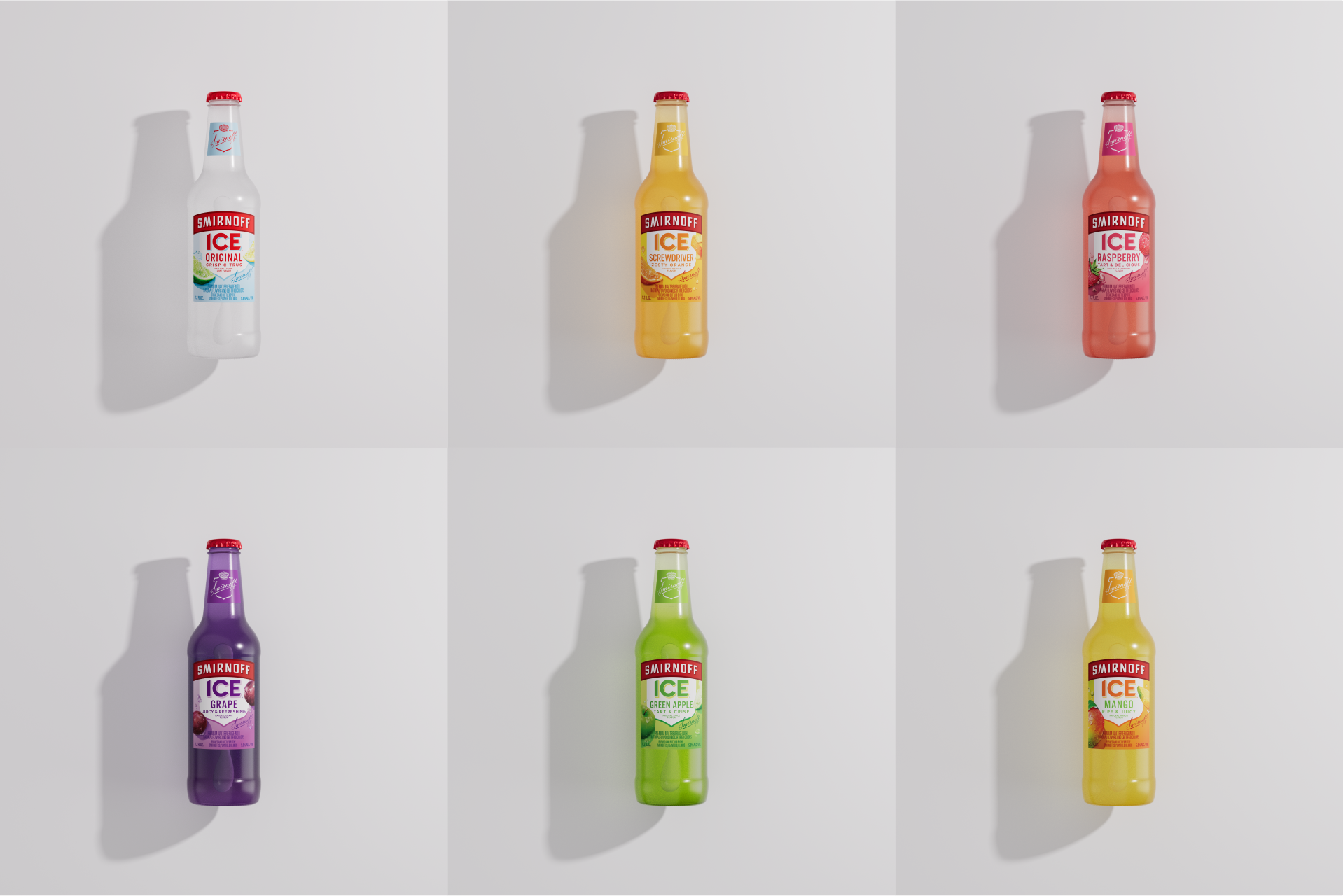
Bottles fresh out of Cinema 4D, before retouch and animation
VISUAL DIRECTION
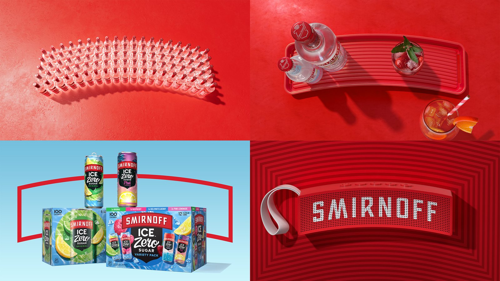
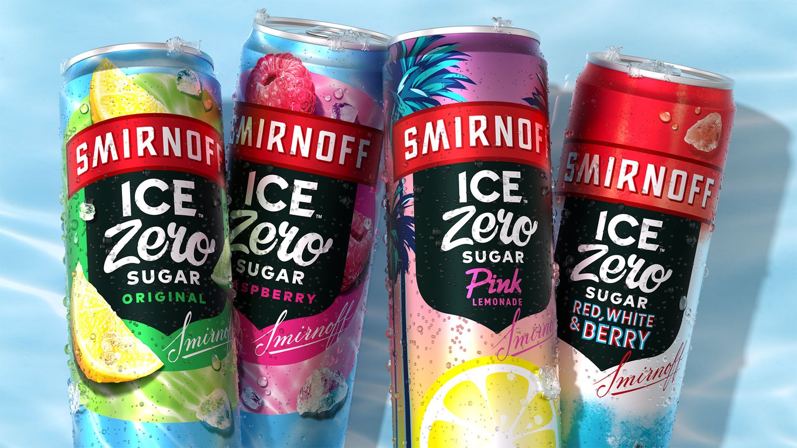
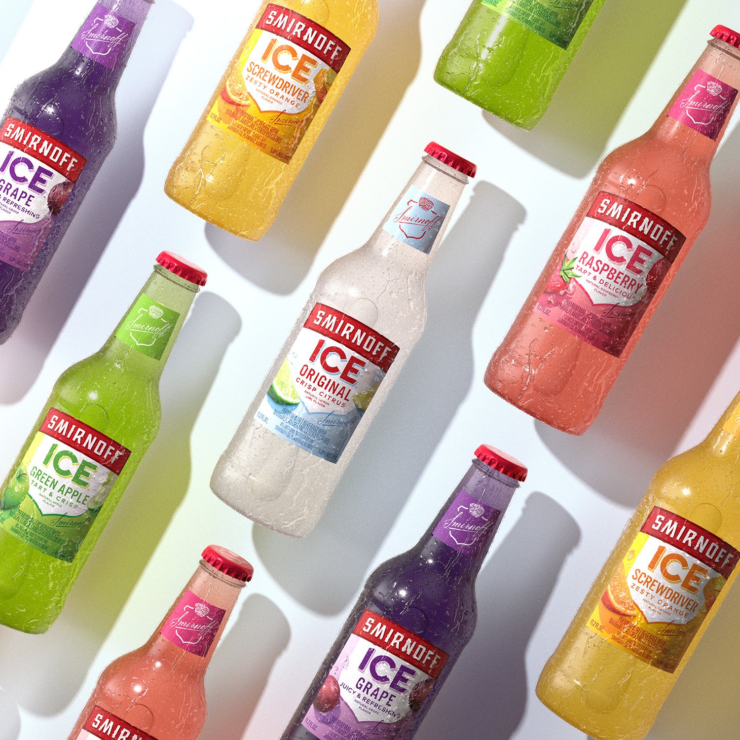
Saturated, Zesty, and Energetic The aesthetic shift was clear: a sharp pivot from the “icy industrial” look of the 2000s to a vibe that was sunny, juicy, and flavor-forward. We let the saturated colors of the six core bottle flavors——Original, Grape, Green Apple, Mango, Screwdriver, and Raspberry——dictate the palette.
The hero was no longer the “ice,” but the “fruit.” We used 2D and 3D animation to wake up that summer energy, creating a kinetic visual motion language that felt fast but fluid. The lighting was designed to feel like a bright, blue, sunny day——giving off a cool, crisp summer vibe that felt less like a nightclub freezer and more like a poolside cooler.
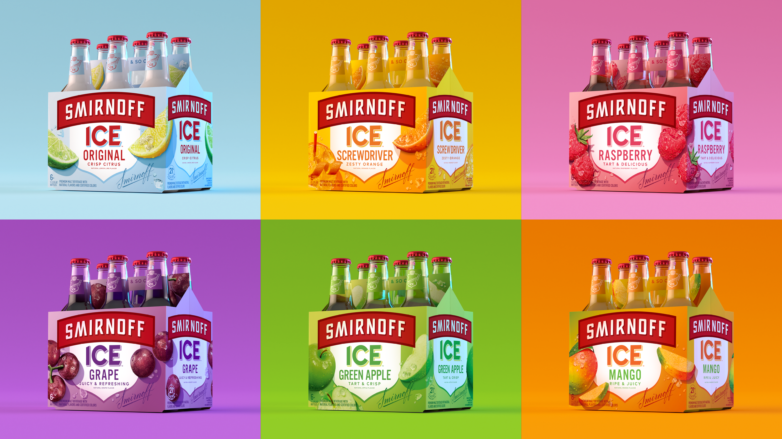
Six-packs with the new designs in studio lights
PROCESS
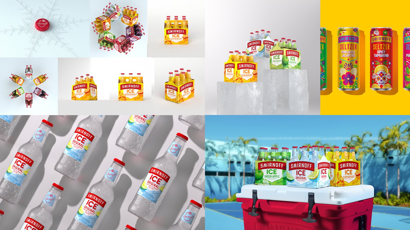
Building the Master Assets I developed the entire asset toolkit from the ground up to maintain full control over the visual quality of Core and Zero Sugar, with labels applied to the 3D models designed for quick updates should the designer provide revisions.
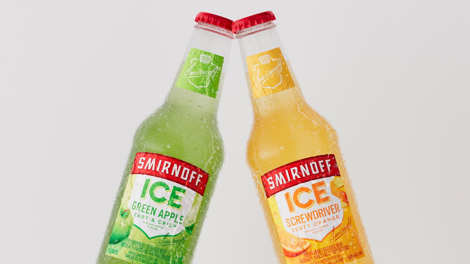
- Precision Modeling: I modeled the bottles, labels, cans, and caps to maintain perfect topology and size ratios. Having direct access to CAD drawings and precise new label dimensions ensured the digital models were 1:1 with the physical product.
- Digital Origami: Building the six-pack was a technical hurdle. I imported the flat cardboard dieline directly from Illustrator into Cinema 4D and folded the planes in 3D space. This was the only way to make sure the packaging looked true-to-measurement rather than just “eyeballing” the box.
- Physical Realism: I requested photos from the client taken under different lighting to study the liquid’s color and refraction for the upcoming launch. This helped me build custom shaders with accurate hue and density for each of the six flavors.
- Natural Simulation: To create the “refreshment” look, I modeled custom ice and used X-Particles to simulate high-fidelity water condensation that formed realistically on the surface of the cans.
- Proactive Asset Development: Because I had built the entire asset toolkit during earlier booking and downtimes, the project was ready to move into the animation phase immediately once the launch was greenlit.
Close up shot of Ice Zero cans, before going into animation
TECHNICAL EXECUTION
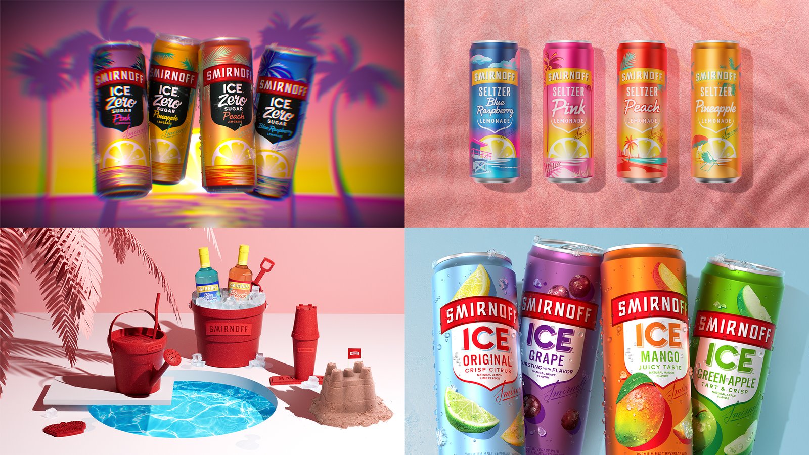
Adaptive Deadline Solutions This project became a last-minute rescue mission due to an expedited launch timeline. With the previous animator unavailable, I was brought on to handle the entire 3D animation pipeline within a three-day finalization window, requiring a weekend sprint to hit the client’s deadline.
- Hybrid Workflow: Glass and liquid materials typically increase render times by 200%+. To mitigate this, I delivered a mix of fully rendered 3D scenes and individual 2K turntables with AOV passes. This provided the editor with the flexibility to comp, scale, and position assets in After Effects according to the storyboard, ensuring we met the deadline without sacrificing quality.
- The “Flavor-Swap” Transition: One scene required 90+ bottles transforming flavors. To manage the render load, I animated the transformation but rendered only the start and end frames. I then exported a luma matte sequence of the motion, allowing the editor to wipe between the flavors in post—saving 20+ hours of render time.
- High-Pressure Turnaround: Through additional optimization of Octane’s render samples and trace depth, I was able to deliver the full suite of high-fidelity assets within the 72-hour window, successfully pivoting the project from a potential delay to a successful launch.
Six-packs and their shippers, originally rendered in 8k billboard size
OUTCOME
A Category Leader Reborn The reinvention was an immediate commercial and critical success. The motion work supported the launch and helped define the new energy of the reinvented brand across social media.
- Commercial Impact: In the 26 weeks following the launch, Smirnoff Ice saw a 3.5% sales increase——a massive shift for a brand of this scale.
- Award-Winning Design: The project took home Gold at the Transform Awards for “Best Use of Glass Packaging.”
- Agency Kudos: The quality of the 3D renders was so high that partners at McCann, Diageo’s Global Creative Agency of Record, remarked on the exceptional fidelity, noting it set a new benchmark for their internal creative teams.
Custom animation for keynote intro
Flavor Bombs Loading...
WIPs and Other Smirnoff LookDevs