Dettol: Protecting What Matters
Visual Refresh for the World’s #1 Germ Protection Brand
YEAR 2022
CLIENT Reckitt
AGENCY Design Bridge
MY ROLE Modeling, LookDev, Animation, Rendering
DURATION 1 Week
TOOLS Cinema 4D, Illustrator
CREATIVE DIRECTION Alessandro Foschini
2D MOTION & EDIT Abbi Chard
3D ANIMATION Gan Lin
INTRO
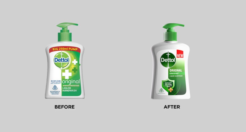
Redefining Personal Care Following a massive surge in global demand in 2021, Dettol——a global powerbrand holding an 85% market share in the antiseptic category——underwent a strategic harmonization of its identity across international markets. The goal was to pivot from a purely clinical antiseptic image to a holistic “personal care” brand. This shift required a unified visual language that combined Dettol’s medical heritage with a warmer, family-focused wellness aesthetic.
I paired with a Senior Motion Designer at Design Bridge London to deliver all seven 3D product sequences for a 33-second brand reel. The piece was designed as a high-level boardroom pitch to showcase the new packaging for body wash, hand wash, sanitizer, and solid soap.
From cheap 2000s asthetic to authentic, wellness-driven identity
VISUAL DIRECTION
From Clinical to Vital The visual language moved away from the “dishsoap lime green” of the past in favor of a rich, organic green that signaled the brand’s shift toward natural vitality. I utilized a clean white lighting setup to emphasize purity and create a soft, luminous quality on the white bottles. This approach resulted in an aesthetic that felt invigorating rather than sterile, distancing the brand from its industrial origins and realigning it with an ethos of holistic health.
The new lineup
PROCESS
Tactile Realism and Technical Precision My role involved exporting finalized high-fidelity labels from the London team’s Illustrator files and applying them to client-provided CAD models(except soap and hand sanitizer, which were fully modeled by me), translating them into accurate assets through dedicated lookdev.
- Preserving Detail with ACES: While testing the initial shots in sRGB, I found the white highlights were clipping and flattening the geometry. In need of a wide gamut space, I turned to the ACES——color system developed by the Academy of Motion Picture Arts and Sciences. It provided the perfect use case here to preserve high dynamic range, keeping the highlight roll-off smooth and ensuring the subtle, matte textures of the plastic remained visible.
- Material Authenticity: I proactively studied the physical properties of the body wash, liquid hand wash, and hand sanitizer to ensure tactile accuracy of those bottles in close-up macro shots.
- Intentional Pacing: I made a deliberate decision to shy away from “trendy” camera movement or distorted lenses. Instead, I used smooth, controlled animation that allowed the viewer to actually see the new label details. This steady movement was a conscious choice to reflect the reliability and steadfast trust of a brand built on 99.9% protection.
Macro shot of the product. Notice subtle tactile texture on the white plastic
OUTCOME
A 90-Year Global Legacy Modernized The project effectively visualized Dettol’s new design language across its core UK product range. The final film provided a clean, professional aesthetic for the updated packaging, helping the brand bridge the gap between clinical germ protection and daily personal care. Following the wider rollout of this new identity, the brand stabilized its sales at 40% above its pre-pandemic levels.