Durex: Pleasure with Purpose
Redefining the World’s #1 Condom Brand
YEAR 2021
CLIENT Durex
AGENCY Design Bridge
MY ROLE 3D Concept, LookDev, Animation
DURATION 1 Week
TOOLS Cinema 4D, Illustrator, Photoshop
CREATIVE LEADERSHIP Claire Robertshaw
3D SCULPTURE Nina Marie Girod
3D LOOKDEV Gan Lin
2D MOTION & EDIT James Morgan, Will Meighan
BRAND DESIGN Andrew Hirst, Marko Hoedl, Jea Hyun, Lisa Napier, Norval Denton
CLIENT TEAM Jess Schulz
INTRO
Empowering Sex in its new Era Originally registered in 1929 by the London Rubber Company, Durex has been a pioneering force in prophylactics for decades. However, the 2020 pandemic disrupted the entire industry—sales dipped significantly as social distancing became the norm. To recover, the brand needed to transcend its “clinical utility” roots and connect with a new Gen Z audience that is more open, honest, and expressive than ever before.
Durex partnered with Design Bridge for a massive regional overhaul of its visual identity and packaging across the UK, US, Spain, France, and Italy. The goal: pivot from “family planning” clichés and hypermasculine tropes toward a positive, inclusive lifestyle brand that encourages the upcoming generation of consumers to explore and experiment.
Notice ‘X’ in the logo is liberated from its historical "lozenge" boundary
CHALLENGE
Breaking the Mold The London and New York design teams spent over a year redefining the brand—liberating the ‘X’ in the logo from its historical “lozenge” boundary, developing the bespoke typeface, One Night Sans, and revamping the entire condom lineup.
I was a fresh new cgi artist at that time, and the agency needed someone to create high-fidelity 3D assets and visual worlds for the product to sit in for the final launch. I joined the team pretty late- just as the label designs were about to enter their print production stage.
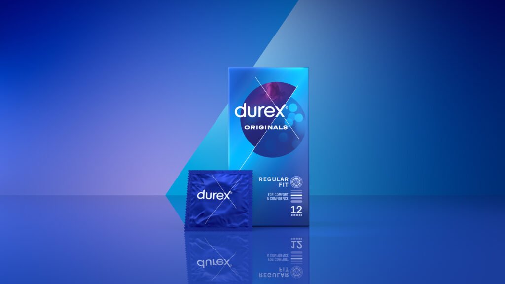
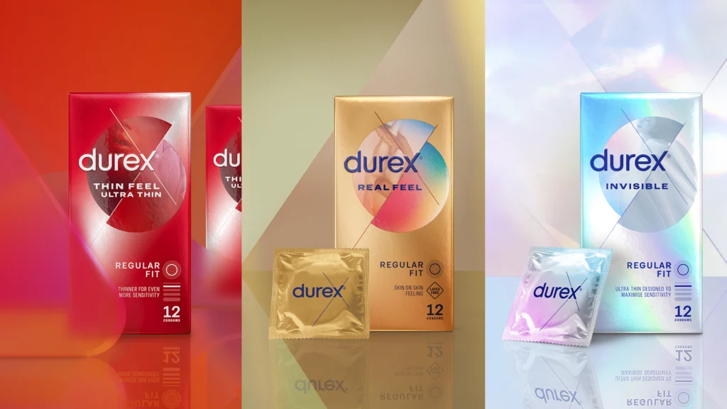
Classic / Originals: Blue, straightforward, and authentic
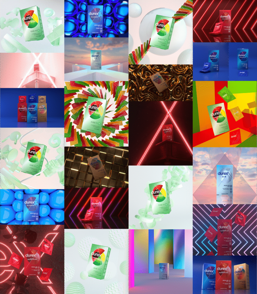
VISUAL DIRECTION
Infusing Themes In a 1.5-week sprint, I was briefed on five product variants:
- Classic / Originals: Blue, straightforward, and authentic.
- Extra Sensitive / Thin Feel: Red and sensation-focused.
- Air / Invisible: Light and “heavenly.”
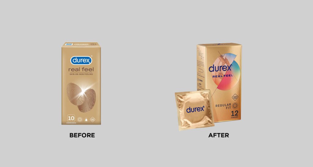
- Real Feel: Warm gold, natural-toned, and premium.
- Tropical: Vibrant, colorful, and flavor-forward.
My role was to conceptualize and iterate the visual environment for each, exploring lighting, tone, and composition to reflect their intended character.
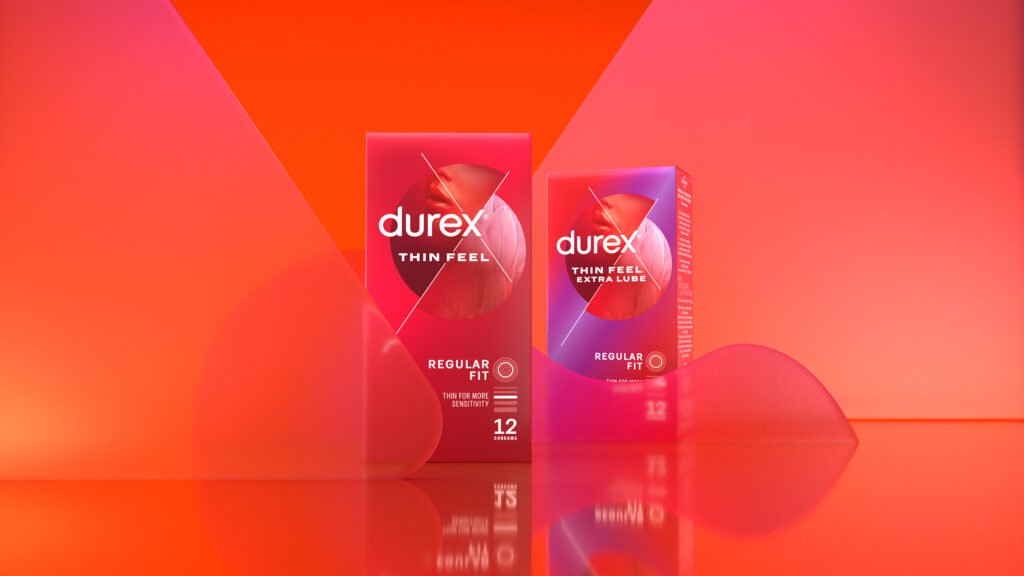
Extra Sensitive / Thin Feel: Red and sensation-focused
OUTCOME
Market Impact It’s rare for a category leader to make such dramatic changes to their design, let alone one with the history of Durex. The rebrand moved Durex from an industry-wide slump in 2020 to a massive global rebound.
- Sales Growth: The updated visuals helped consumers identify Durex on-shelf faster; the brand saw 30% rise in sales following the rollout, significantly outpacing the category growth.
- Portfolio Standard: For over two years, this project served as the crown jewel of Design Bridge’s global portfolio—acting as the benchmark for a successful legacy brand pivot.
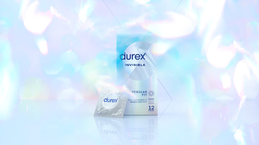
Air / Invisible: Light and "heavenly"
Brand video created by London motion team
Latest updated design
A rush of red. A surge of sensation - earlier idea based off night bar
Packed with colorful flavors - earlier idea
Early work-in-progress LookDev